Seekr
For my Information Architecture & Design class, my 5 member team sought to create a platform to help creatives who seek space and collaborators for various pursuits. My primary roles were to lead user research and testing while collaborating on content design throughout the quick build process.
Problem Statement–Artists and vendors experience difficulties in making connections and finding space to show and market their work. Once an artist or vendor has successfully scheduled a pop-up, art viewing, or other event, significant barriers to success remain. Space and business owners likewise face challenges in attracting local talent. Many are simply too busy with the day-to-day activities of running a business to explore and make new connections.
Our Solution–Seekr is a website (currently under development) that connects artists, vendors, and space owners, thus allowing them to share event space, build stronger professional and collaborative networks, and create new, unique experiences for their audiences and patrons. For our design direction, we draw our inspiration from nature, particularly the concept of mutualism, a symbiotic relationship in which both beings benefit from the connection.
During our initial concepting phase, I led my team in creating a survey to identify pain points for those renting space for creative pursuits.
Objectives
To identify a need in the domain of our choice by doing the following:
- Conducting generative user research
- Establishing gaps and strengths/weaknesses of any current solutions
To develop a solution for this need by doing the following:
- Mapping the content and information architecture of our platform to effectively serve our identified users' needs and match their expectations
- Creating low, middle, and high fidelity mock-ups and/or prototypes
- Testing the effectiveness of these designs with users
- Iterating our solutions accordingly in reaction to user feedback
Methods
Survey–During our first group meeting, I drafted an initial survey (with input from the team) to get a better grasp on our domain. The instrument included a screener, so that we could target a specific audience: space owners and creatives who rent space. I also included a form to collect contact information from participants for future interviews and user testing. We distributed our survey over social media and received around 30 responses in under a week. After the results of our survey came in, I noticed that most of the respondents defined themselves as space renters, who are either currently renting a space or who had rented previously. This finding helped us adjust our focus, as we initially viewed our primary users as the space owners. Overall, the biggest concerns expressed by creatives centered around the lack of amenities and support to assist renters in their goals, along with poor transparency of information about available rental spaces. As a group, we discussed moving forward with interviewing space owners, so that we could learn more about their motivations and pain points.
We created user personas and workflows during our research phase and used them while sketching early wireframes for our first stage of testing.
Competitive Analysis–Concurrently, we conducted several rounds of competitive analysis, during which we explored websites and applications in concentric (e.g. collaborative sharespaces) and adjacent (e.g. lodging) domains and narrowed our focus while diving deeper at each stage. The purpose of our competitive analysis was to better understand the current competitive landscape. It enabled us to identify gaps we could fill and figure out how we could stand out from existing products. Through this research our team was able to identify market gaps, which helped create a pathway for refining the focus of our solution. Through a broad analysis, our team found that although there are apps for artists to find spaces, there are no apps that allow spaces to find artists/vendors, for artists/vendors to collaborate with other artists/vendors, or for a network of diverse spaces and artists/vendors to connect and thrive. After deciding to target artists, vendors, and space owners, we narrowed our analysis to a handful of products that served as direct competitors. We examined these products in greater detail and identified key areas we could stand out, including facilitating collaboration and building community. We further explored these products, as well as a few indirect competitors, in a feature comparison. This focused competitive analysis helped us identify key features we needed in our product and gaps we could fill to differentiate our product from direct and indirect competitors. As we wanted to keep architectural strategy in mind, we also compared the sitemaps of several competitors at this stage. On the carousel below, you will find our focused competitive analysis, feature comparison, and competitor sitemap comparisons.


6 Interviews (2 rounds)–While working on our competitive analysis, a team member and I engaged two individuals who manage creative sharespaces for early probing interviews, so that we could learn more about unmet needs in the market. During one of the interviews, we toured a local space and documented pain points while collecting artifacts. In reaction to the early results of our survey, competitive analysis, and initial interviews, we determined that we needed to change direction and narrow our focus in order to fill a niche and remain competitive. As part of this transition, we collaborated on a focused interview instrument, which a team member and I used while talking to three local space owners/managers and one artist to further explore pain points and gaps.
During our second round of interviews, we discovered that there is a real need for a tool to provide a platform for networking, aid in event planning and scheduling, and give artists and vendors adequate descriptions of available spaces. All three space owners we interviewed enjoy providing their patrons with unique experiences and would like to be more involved in supporting the local community of artists, vendors, and charities. The artist described a variety of situations in which she hadn't received the information or support she needed to host successful art viewings. These final four interviews revealed a strong desire among space owners and creatives alike to build community and collaborate, a key finding in the development of our project direction.
With a more firm understanding of our project direction, goals, and audience, we decided to move forward with the architectural strategy phase of our project, in which we identified and grouped content, sketched early wireframes as a team, and created user personas and journeys/workflows. On the carousel below, you will find artifacts and deliverables from this stage of our project. I drafted a content model and blueprint using our wireframes and collaborated with another team member to create user personas, journeys, and workflows.


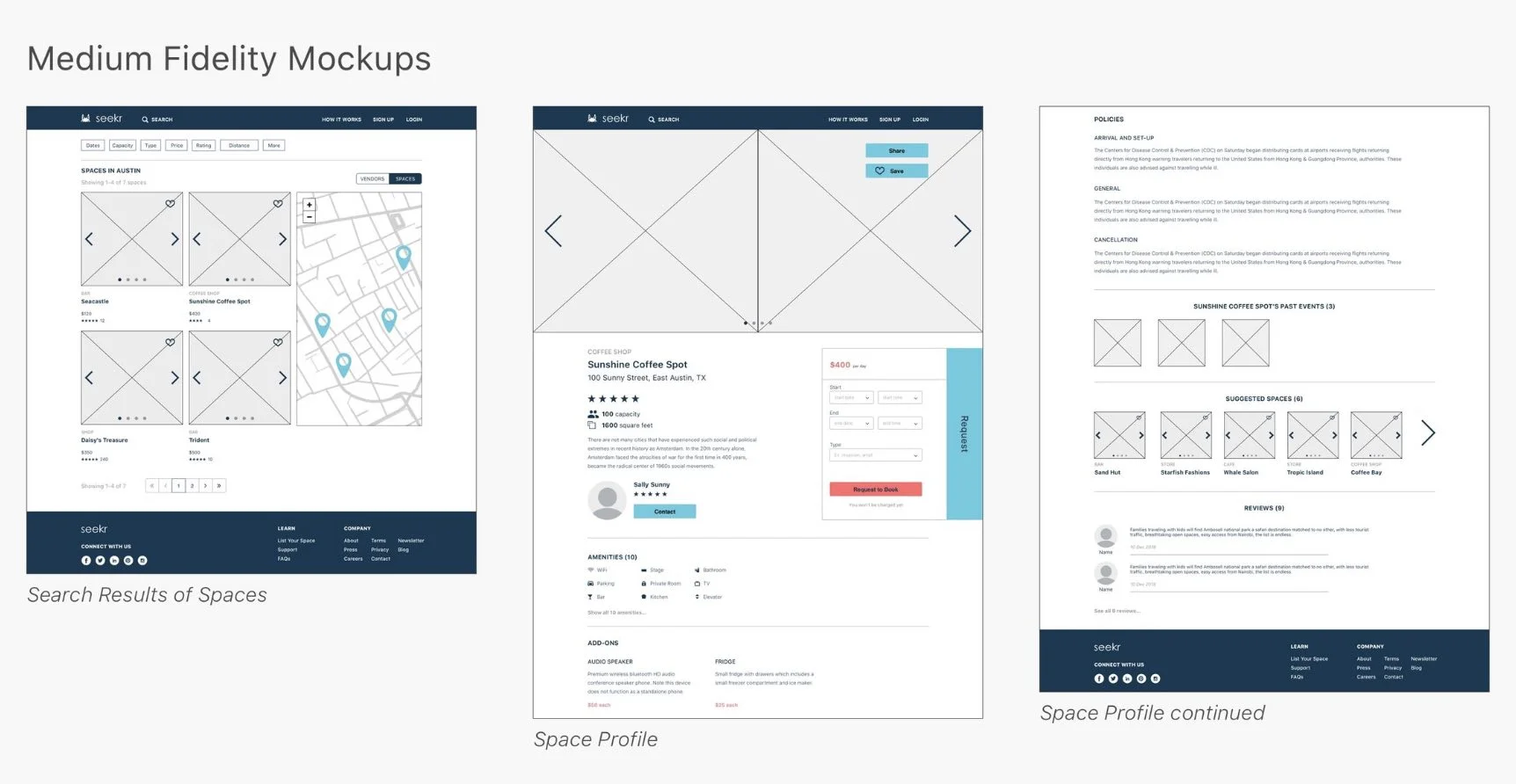
Iterative Testing and Design–After completing our initial sketches, our UX Designers cleaned them up and implemented them in Sketch and InVision, which we also used for all mockups and our final prototype. Throughout the stages of iteration, we used Invision to collaborate, annotate screens, and host mockups for all rounds of user testing. Ultimately, we tested with 13 unique participants, 9 of which were representative users, over 4 rounds of testing. We tested our early wireframes in person, our middle fidelity mockups in person, and our high fidelity mockups and final prototype both in person and asynchronously with usertesting.com. As the lead researcher, I drafted all the test plans for our project with input from the group. Overall, we tested the various iterations of our prototype with 13 unique users (9 of which were representative) over 4 rounds of testing. For our final prototype test, I invited back one of our middle fidelity testing participants to build off of the progress we had made. Throughout the phases of testing, I used our established user types and journeys to create scenarios for our interview instruments, which three team members (myself included) used to moderate our sessions. During the 8 tests I personally conducted, I encouraged my test participants to think aloud and explored expectations by including probing questions as needed. From these probes, we conceived additional features to be explored at later stages of development, such as a touring feature and a collaborative event planning feature. On the carousel below, I have included screenshots of our low fidelity wireframes, our middle fidelity mockups, and two iterations of our high fidelity mockups.


Logo Design and Branding
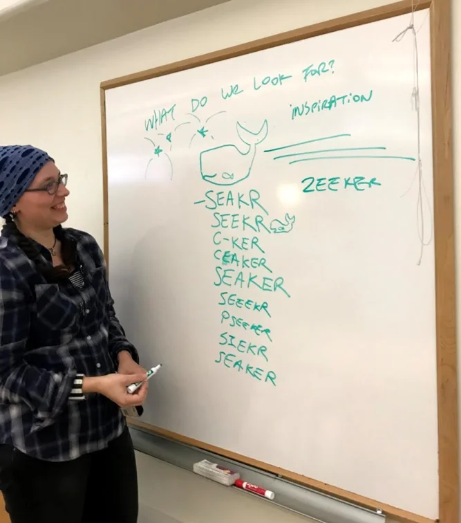
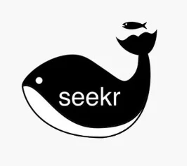
During the same week we created, implemented, and tested our first set of wireframes, we set out to define our branding direction, so that we could align our engagement goals, keep on theme (both in visual and verbal respects) in later iterations, and prevent scope creep. We used the concept of mutualism as a primary inspiration for our branding, because we wanted to communicate that both artists/vendors and space owners benefit from collaborating using our platform. On the carousel below, you will find artifacts and deliverables from the logo and branding phase of our process, for which we drew inspiration from the concept of mutualism in the ocean. We decided to focus on this concept because we wanted to communicate that both collaborators and space owners benefit from connecting with each other using our platform. We explored different logo options with whales as the main element, but we ultimately settled on a crab as our mascot for its “seeking” or foraging nature and its propensity for forming mutualistic partnerships with a variety of other organisms.


Above is the primary search bar from the home page of our platform. Throughout the design process, we iterated the wording and placement of text. Ultimately, we added a tagline at the top to explain the purpose of the platform and a line just above the bar to urge users to search and explore, which is the primary task for engaging with content on the website.
Key Findings
Lack of support for artists/vendors–One of the biggest takeaways from our research and testing was the desperate need for our solution. The amount of physical and digital legwork necessary to network, market oneself, and find work as an up-and-coming artist or vendor presents a significant barrier to access. Lack of transparency in policies and details concerning set-up can lead to a loss of time, money, and other opportunities for artists/vendors .
Copywriting is key–During testing of our low fidelity mockups, it became clear to me that the copy in our prototype needed just as much attention as architecture and visual design. As I am a writer with editing experience, I adjusted the wording of our mockups through the several rounds of testing until it matched our intended tone, branding direction, and representative users' expectations. During our final round of high fidelity prototype testing, all 4 users understood the purpose of the platform without leaving the home page.
An early affinity diagramming session to ensure everyone was on the same page moving forward.
ChallengeS
In our initial survey, we unintentionally screened out potential users. We only allowed people to complete the survey who had previously rented their space out to creatives or who had already rented space for creative purposes. This didn’t allow for inclusion of what would become our primary users: artists and vendors seeking a way to build their networks and showcase their work. This finding underscores the importance of including the perspectives of new or inexperienced users in product research, validation, and testing, all the while being cognizant of our own mistakes along the way. As I'm opportunistic, I contacted a few of the users who were screened out for later testing sessions and interviews, so that we could test with users who were struggling to market themselves.
During our generative research phase, we realized that although we all wanted to create a solution for creatives, our entire team had different mental models concerning our targeted user base, which led to problems in determining a project direction. In an effort to sync our individual product goals, our team used facilitated strategic planning sessions to evaluate and weigh the benefits of each idea and potential user base. This process allowed our team to make data-driven decisions that were backed by needs rather than individual biases.
During testing, our representative users were enthusiastic and provided key feedback for redesigns and additional features to be explored in future rounds.
Next Steps
- We are currently determining which features to include in our Minimum Viable Product, so that we can move forward with redesigns and testing.
- We are also researching funding options and platforms for implementation.
- We have started concepting additional features based off our research and testing, to be added after the core is built. Moving forward, we aim to create more tailored experiences for different types of artists and vendors within our framework, all while maintaining flexibility and simplicity in design. We will explore this through the process of changing the interface depending on what type of user is logged in.
Seekr video created by team member Serena Mistry using Adobe After Effects.
For this project, we created a 144 page final report, which contains most of our artifacts and deliverables. I can provide a copy upon request.